
 I got my first print copy proof from Createspace in less than a week. I was pretty impressed with how fast it got here, but not with the book itself.
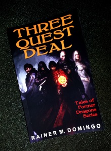
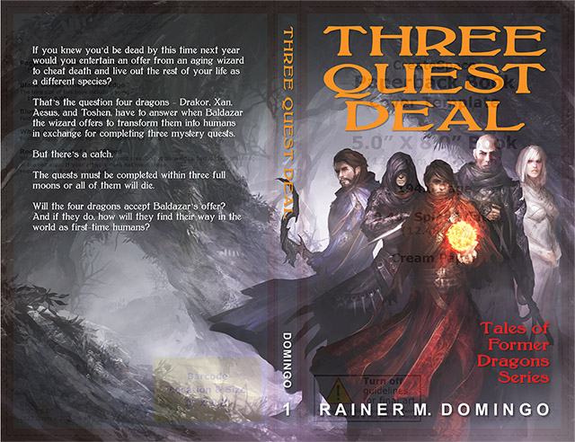
As expected, based on other author posts online, the cover image was much darker than the computer image. Since this is my first Createspace cover, I needed to see it printed before adjusting it. I upped the brightness by 60 ticks and I’m hoping it’s going to improve the image without washing it out and losing detail.
I placed the book’s title too close to the top edge, and my name too close to the bottom and side edges. I fixed the title by using Photoshop’s Edit->Transform->Scale, and my name by changing the font size and repositioning the text higher up from the bottom.
Inside the book, I thought that setting the inside margin to .75” was going to be sufficient, but it looks like I need a bit more room. If I leave it as is, the text closest to the seam on the curved page curves more inward than I would like. I think adding .25” is going to fix it.
Once I get the revised proof, I’ll provide an update.
Update: The new proof looks good! I’m happy with it.

May 31, 2015 at 5:09 am
That’s a pretty cool book cover. Good luck.
LikeLike
May 31, 2015 at 9:14 am
Thanks! The artwork was done by Daniel Kamarudin – http://thedurrrrian.deviantart.com/gallery/
LikeLiked by 1 person
May 31, 2015 at 6:13 pm
Nice cover. Luck with the book.
LikeLike
May 31, 2015 at 7:20 pm
Thank you!
LikeLike
Pingback: How to prepare a CreateSpace cover for your novel | Rainer M. Domingo